Short answer: before ordering custom letter stud earrings, confirm the exact character, uppercase or lowercase form, script, viewing direction, quantity and material of each visible part. If a letter could be confused with another symbol—or if it uses Arabic, Hebrew, a diacritic or an unusual mark—request a visual proof before production. A typed character is not automatically a complete jewelry specification.
The goal is not to find one “perfect” alphabet. It is to make sure the maker and buyer are referring to the same character and the same visual result. Letterforms change with case, type style, scale and direction. Metal construction is a separate question: a warm-colored character may be brass, 24K gold, plating or another material, and the product record—not color alone—must identify it.
The seven details to confirm
| Specification | What to record | Why it matters |
|---|---|---|
| Exact character | The character itself plus its name, such as “Latin capital M” | Different characters can look alike in some fonts. |
| Case | Uppercase, lowercase or a specific mixed-case form | Case can change shape, size and recognition. |
| Script/language | Latin, Greek, Cyrillic, Arabic, Hebrew or another identified script | Look-alike glyphs may not be the same letter. |
| Direction | How the front should read when worn and viewed by another person | Asymmetric letters and RTL scripts can be reversed or reordered. |
| Quantity/order | Single or pair; left/right character order for a pair | “A/M” can mean matching, paired or ordered initials. |
| Scale and style | Face dimensions, stroke/detail limits and approved visual proof | Fine features may merge or disappear at stud scale. |
| Materials | Base, character/inlay, post and backing separately | A two-tone appearance does not identify composition. |
Start with the character, not a screenshot
Send the character as editable text when the order form allows it, then add a screenshot or drawing as a visual reference. The Unicode Standard treats uppercase, lowercase and titlecase as formal properties. It also notes that case variants can differ markedly in shape and size. That means “m” and “M” are not interchangeable production notes simply because they represent the same basic letter in ordinary writing.
For anything beyond basic A–Z, record both the visible character and a plain-language identifier. For example: “Greek capital alpha Α, not Latin A,” or “Latin capital O, not zero.” This is especially useful when an order passes through multiple devices, fonts or languages.
Do not paste a decorative ligature or symbol and assume every workshop can reproduce it. The order page should state the available range, and the maker should confirm whether the requested form remains recognizable at the actual scale.
Why visually similar letters need a proof
The Unicode Consortium’s confusables specification explains that visual similarity varies by font and size. A Latin letter, Greek letter, Cyrillic letter, numeral or punctuation mark may look identical in one style and clearly different in another. The familiar examples include O and 0, I and l, or Latin B and Greek beta in capital form.
Jewelry adds another variable: scale. A thin counter, diagonal or serif visible on a monitor may become less distinct when translated into a small metal detail. No authority provides a universal “minimum millimeter size” for every custom letter earring. The responsible process is therefore visual proofing, not a fabricated threshold.
A useful proof should show the character at the intended orientation, the outline of the earring face and the approximate front dimensions. If the seller cannot document those dimensions, ask before ordering rather than estimating from a photograph.
Case, stroke, spacing and contrast affect readability
Legibility depends on more than height. The U.S. Access Board’s guidance for signs discusses case, conventional character forms, proportions, stroke thickness, spacing, contrast and non-glare finishes as separate factors in visual readability. Those requirements apply to signs—not earrings—and should not be copied as jewelry dimensions. They do provide a useful design lesson: enlarging a highly decorative letter does not automatically make it clearer.
For a compact stud, compare at least two proofs if the maker offers options: a conventional form and a more decorative form. Check the hardest parts first:
- Does C remain distinct from G?
- Does O remain distinct from 0?
- Do M and W still read correctly in the chosen orientation?
- Does a narrow opening in A, R, P or B remain visible?
- Does the character contrast with the surrounding metal in ordinary light, not only in a high-contrast product photo?
These are inspection questions, not promises. Hand finishing, surface texture and lighting can change the appearance of a photographed piece.
Direction matters for asymmetric letters and RTL scripts
Latin text normally runs left-to-right. Arabic and Hebrew normally run right-to-left. The W3C Internationalization explanation of the Unicode Bidirectional Algorithm shows that base direction affects the display order of mixed-direction text, punctuation and numbers. This is a software and text-display standard, but it exposes a real ordering risk when a custom instruction includes multiple characters.
For a single asymmetric letter, specify the intended front view: “This is how it should read to a person looking at the wearer.” For a pair, identify which character belongs on the wearer’s left and right ear, or state clearly that either order is acceptable. A mirrored pair is not the same as two identical upright characters.
For Arabic, Hebrew or any connected or context-shaped script, request a workshop proof. A single typed character isolated from a word may not have the same form it would take in connected text. Do not assume a basic Latin-only product option supports another script unless the seller confirms it.
Separate letter design from metal claims
A gold-colored initial is not automatically gold. The U.S. Federal Trade Commission’s jewelry guidance explains that 24K describes pure gold in the karat system, 925 describes 925 parts per thousand silver, and plating or vermeil are different constructions. An order specification should name the material of the character and base separately.
Historic collections also show that letters and monograms are design devices rather than one fixed modern style. The Metropolitan Museum of Art records a Castellani brooch with Greek letters, while a Smithsonian jewelry-design record includes a monogram or royal cipher. These objects demonstrate historical use of letters in jewelry; they do not assign a universal meaning to a modern initial.
Two current Skullearring examples
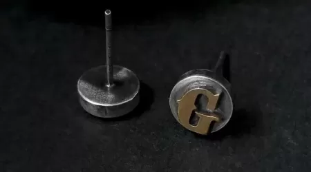
Silver base with brass character
The current Custom Letter Stud Earrings record offers a single or pair, letters A–Z, numbers 0–9 and simple special characters. It identifies a silver base and brass character inlay. It does not currently state an exact silver fineness, face dimensions, weight or post material, so those details remain unknown rather than being inferred from the gallery.
For this model, the live order form is the authoritative place to select quantity, character type and the requested character. A pair may use matching or different characters. If you need a special mark, lowercase form or an orientation that is not obvious, request confirmation before production.
999 fine silver with 24K gold initials
The Personalized Initial Stud Earrings have a separately documented construction: a 999 fine-silver disc with an uppercase 24K gold-inlay letter, black oxidized or natural-silver finish, and single or pair options. The current letter list is limited to L, Z, N, W, M, Y, C, X, H, S, J, G, O and Q. That list can change, so check the live options rather than assuming the full alphabet.
These are materially different products. Brass should not be described as 24K gold, and the 24K model should not be described as offering every A–Z letter when its current option list is narrower. For more on component-level disclosure, read our guide to earring bodies, posts, backs and inlays.
A practical proof-approval checklist
- Copy the exact character into the order. Add its name when it could be confused with another script, number or symbol.
- State case explicitly. Write “uppercase M,” not only “M initial.”
- State single or pair. For two different characters, give wearer-left and wearer-right order if it matters.
- Confirm front orientation. Use a simple annotated sketch for asymmetric or mirrored forms.
- Check the permitted option list. Do not assume an unsupported character can be produced.
- Ask for named dimensions. Face diameter or width is different from post length and total depth.
- Read materials by component. Base, inlay, post and back may differ.
- Approve one final proof. Keep that proof and the written specification with the order record.
The broader earring product-page checklist explains quantity, measurement and component fields in more detail. If you are comparing precious-metal constructions, browse the 24K gold-inlay silver earring collection.
Frequently asked questions
Should I choose uppercase or lowercase for initial earrings?
Choose the form you want to see, then confirm it is offered. Uppercase often produces a more compact, conventional silhouette, but no case is universally best. Lowercase forms may be more distinctive and may also need more careful proofing.
Can two different letters be used as a pair?
Yes when the specific product offers that option. Record both characters and their left/right order if orientation matters. Do not rely on the sequence being interpreted the same way by every maker.
Can I order Arabic, Hebrew or another non-Latin letter?
Only if the seller confirms the script and supplies an acceptable proof. Direction, contextual shaping and available tooling can affect whether the requested form can be produced.
How large should a letter stud be to remain readable?
There is no universal minimum that applies to every letter, type style, material and process. Ask for the face dimensions and a scale proof, then inspect the actual character’s openings, stroke separation and contrast.
Does a yellow letter mean it is 24K gold?
No. Color does not verify composition. The product record must distinguish brass, gold inlay, plating, vermeil and other constructions.
Bottom line
A reliable custom-letter order identifies the exact character, case, script, direction, quantity, scale and component materials. Basic A–Z initials may need only a clear order entry; ambiguous symbols, mixed scripts, decorative forms and asymmetric pairs deserve a visual proof. Keep the proof with the order, verify the live product options, and never infer metal content from color alone.
Leave a comment